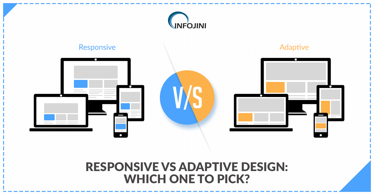
Making the Right Choice between Responsive and Adaptive Design
Every UX designer needs to make a few choices before he begins the user experience design process. Some of these include making the choice between adaptive and responsive design, native and hybrid application, as well as flat or perspective design. Choosing the right set of parameters is critical for every UX designer. Also following the UX design trends will help the designer stay ahead of competition.
Here we shall discuss whether you should go for a responsive or an adaptive web design.
Choosing Responsive Design
You must choose a responsive design, if you plan to have a singular app interface for a browser window on a mobile screen as well as a desktop. Such a design will allow your content to fit in the available space in the correct manner for better readability. Responsive design automatically changes the font and picture size available on the screen depending upon the magnification level that the user chooses.
The difference between responsive and adaptive design lies in the fact that responsive design can be implemented in a relatively simpler way and requires fewer efforts by the developer. Creating a website on a popular CMS (Content Management System) template like WordPress or Squarespace will automatically create a responsive web design. For adaptive website design, there are distinct layouts for different devices. However, for a responsive design, the website detects the type of device and delivers the pre-set layout for that specific design.
If you are a newbie in the field of web designing and wish to rank higher in search engine results, it is advisable for you to go with the responsive web design. This kind of design will help you ensure that your content is visible perfectly on both mobile as well as desktop browser screens.
Choosing Adaptive Design
Adaptive design is similar to the responsive design in terms of function, but not exactly the same. Here, you have to choose a fixed set of templates for displaying on different sizes of screen. The arrangement of navigation buttons and other design elements can be carried out by the website/application developer in a pre-defined manner.
Adaptive design is a complicated design process and requires dedicated design elements. Only large websites with a lot of content go for this kind of design. Websites like Amazon.com run on an adaptive design to serve its customers better. Adaptive web design helps developers add advertisements at different places on mobile and desktop browsers to ensure that they do not cause any hindrance to the user experience.
The debate between responsive vs adaptive design is endless since both have their own sets of pros and cons. Making the right choice between the two depends only on what pros you wish to offer and what cons you can live with. Only the speculative nature of a UX designer who needs to make a choice between adaptive vs responsive pros and cons will help him/her make the right choice irrespective of the ease or toughness of implementation.
Related Posts