 Digital Transformation
 Data Engineering
 Implementation
 Staffing Services


Student, Finance, Financial Aid, and Human Resources insights for Banner ERP data, delivered through a Snowflake Native App.
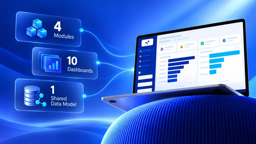
Banner ERP Analytics is a Snowflake Native App designed to provide unified analytics for Student, Finance, Financial Aid and Human Resources operations, powered by curated Banner ERP data. The application covers four business areas and ten dashboards that help institutional users monitor operational performance, identify trends, and make data-informed decisions.
Modules at a Glance
| Module | Dashboards | Primary Banner areas |
|---|---|---|
| Student | Enrollment Dashboard; Course Section Dashboard | Registration, academic history, curriculum, catalog and schedule |
| Finance | Procurements; Accounts Payable | Purchasing, receiving, invoices and checks |
| Financial Aid | Financial Aid Overview | Awards, term awards, disbursements, applicant need analysis |
| Human Resources | Workforce; Payroll; Leave & Absence; Benefits; Position & Vacancy | Employees, jobs, positions, payroll history, leave, benefits |
One Connected Data Model
All four modules share a common set of conformed dimensions – term, student, program, campus, organisation and fiscal / payroll period – so that questions which cross module boundaries (for example, aid awarded to enrolled students in a term, or faculty payroll alongside teaching load) can be answered from the same model.
About Banner ERP
Banner ERP is an integrated higher-education administrative platform used to manage core institutional operations such as the student lifecycle, academic records, finance, HR, financial aid, and advancement. In this solution, Banner acts as the operational system of record, while Snowflake provides the analytics layer that exposes curated data through dashboards for decision support.
Why Banner ERP Analytics?
The Challenge
Institutions rely on Banner ERP for mission-critical academic, financial aid, and workforce processes, but operational data often needs to be transformed into clear, role-based insights.
The Solution
Banner ERP Analytics addresses this need by providing ready-to-use dashboards that simplify monitoring across enrollment, course sections, procurement, accounts payable, financial aid, workforce, payroll, leave, benefits, and position control.
Key Benefits
- Consolidated view: Provides consolidated analytics experience across student, finance, financial aid and human resources operations.
- Less effort: Reduces the effort required to interpret raw Banner tables and operational records.
- Faster insight: Enables faster review of key performance indicators, trends, and exceptions.
- Connected data: Uses shared (conformed) dimensions and the Banner PIDM as the universal person key, so students, instructors and employees connect across modules.
- Role-based decisions: Supports decision-making for registrars, deans, academic planners, procurement officers, controllers, financial aid directors, HR and payroll teams, and finance leadership.
- Native to Snowflake: Uses the Snowflake Native App model, which allows data applications to run within Snowflake while using application logic, visualizations, and secure sharing patterns.
Snowflake Native App Overview
The Native App Framework
The Snowflake Native App Framework allows providers to build data applications that include business logic, visualizations, and database objects, and distribute them to consumers through listings or private sharing. For Banner ERP Analytics, this means institutions can access dashboards within the Snowflake experience while keeping analytics close to governed Snowflake data.
Application Runtime
The user interface is a Streamlit application packaged in the Native App. It reads only the curated GOLD layer through Snowpark and runs on a Snowflake virtual warehouse (COMPUTE_WH in the reference deployment), so no data leaves the account.
Data stays in Snowflake
The dashboards query governed Snowflake data in place. Nothing is exported to an external BI server, so the same access controls that protect the data also protect the analytics.
Solution Architecture
Data Flow
Banner data moves through three layers inside the DB_BANNER_ERP database before it reaches the dashboards:
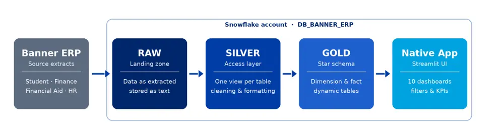
Layer Responsibilities
| Layer Responsibilities | Objects | Purpose |
|---|---|---|
| RAW | One table per Banner extract | Landing zone – data exactly as extracted, stored as text |
| SILVER | One view per RAW table with data cleaning and formatting. | Stable, Banner-named access layer that the models read from |
| GOLD | Dimension and fact dynamic tables (TARGET_LAG = DOWNSTREAM) | Star-schema model with typed columns, surrogate keys and KPI-ready measures |
| App | Streamlit in the Snowflake Native App | Home page, module navigation, filters, KPI cards and charts |
Refresh Strategy
Because the GOLD objects are dynamic tables chained with TARGET_LAG = DOWNSTREAM, refreshing a fact automatically refreshes the dimensions it depends on, and the dashboards always read a consistent snapshot.
Application Modules
Student Module
The Student Module provides insight into student enrollment, credit hour production, Full-Time Equivalent (FTE), new student intake, and course section utilization. It helps users monitor demand, capacity, waitlists, and section performance across colleges, campuses, academic levels, and terms.
- Enrollment Dashboard: Headcount, FTE, Credit Hours, and New Students.
- Course Section Dashboard: Fill Rate, Average Class Size, Waitlist Pressure, and Online Enrollment Share.
Finance Module
The Finance Module delivers visibility into procurement and accounts payable operations. It helps finance and procurement teams understand purchase order cycle time, open commitments, receipt-to-invoice matching, vendor concentration, days payable outstanding, discount capture, and on-time payment performance.
- Procurements: PO Cycle Time, Open Commitments, Match Rate, and Vendor Spend.
- Accounts Payable: Days Payable Outstanding (DPO), Discount Capture, Open AP Balance, and On-Time Payment.
Financial Aid Module
The Financial Aid Module tracks how aid reaches enrolled students. It shows the share of enrolled students who receive an award, the average aid package, how widely Pell Grants reach the enrolled population, and how much of the awarded aid has been disbursed – by aid year, term, aid category, fund, academic level and college.
- Financial Aid Overview: Aid Award Rate, Average Aid Package, Pell Grant Penetration, and Disbursement Rate.
Human Resources Module
The Human Resources Module covers the workforce end-to-end: headcount, FTE, turnover and tenure; payroll cost, overtime and compa-ratio; leave balances and absenteeism; benefits enrollment, cost and ACA compliance; and position control with vacancy and budget-versus-actual salary.
- Workforce: Headcount, FTE, Turnover Rate, Average Tenure, New Hire Rate, and Voluntary Turnover.
- Payroll: Total Payroll Cost, Average Salary, Overtime Rate, Salary Compa-Ratio, Payroll Cost per FTE, and Tax Effective Rate.
- Leave & Absence: Absenteeism Rate, Leave Balance per Employee, Leave Utilization Rate, and FMLA Utilization.
- Benefits: Benefits Enrollment Rate, Employer Benefits Cost per FTE, Benefits Cost as % of Payroll, and ACA Compliance Rate.
- Position & Vacancy: Vacancy Rate, Position Fill Rate, Budget vs Actual Salary, and EEO Category Distribution.
User Interface Pages
Home Page
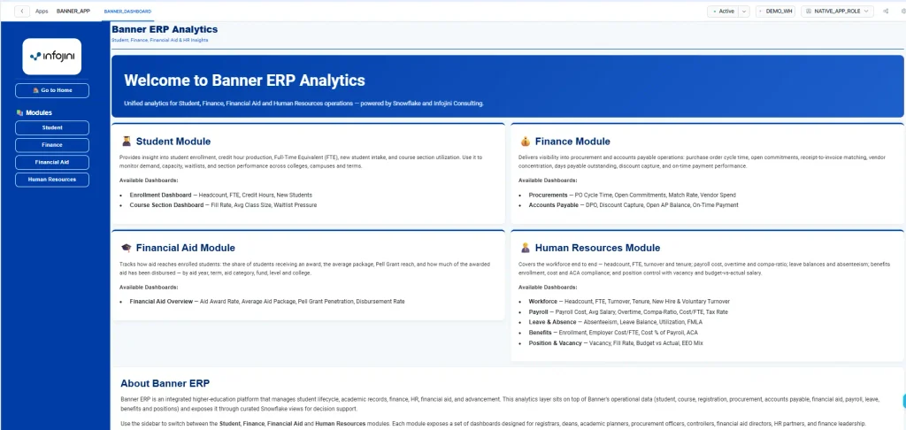
Page Layout
The Home page introduces the Banner ERP Analytics application and provides the top-level navigation experience. The page includes the application title, the subtitle Student, Finance, Financial Aid & HR Insights, a welcome banner, and four summary cards arranged in a two-by-two grid – one for each module. The left sidebar includes a Go to Home button, and module navigation buttons for Student, Finance, Financial Aid and Human Resources.
Module Cards
The Student Module card explains the purpose of student analytics and lists the available dashboards: Enrollment Dashboard and Course Section Dashboard.
The Finance Module card explains the finance analytics scope and lists the available dashboards: Procurements and Accounts Payable.
The Financial Aid Module card describes aid analytics and lists the Financial Aid Overview dashboard. The Human Resources Module card describes workforce analytics and lists its five dashboards: Workforce, Payroll, Leave & Absence, Benefits, and Position & Vacancy.
Navigation
Users can choose a module from the sidebar to move from the Home page into the relevant dashboard area. The Go to Home button is always available and clears the current module selection.
Student Module Page
Enrollment Dashboard
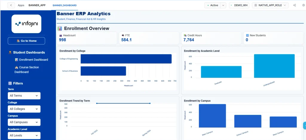
The Student Module page displays student-focused dashboards and filters. In the Enrollment Overview view, users can review key metrics such as Headcount, FTE, Credit Hours, and New Students. The page also includes visual charts such as Enrollment by College, Enrollment by Academic Level, Enrollment Trend by Term, and Enrollment by Campus.
The left sidebar for the Student Module includes dashboard navigation for Enrollment Dashboard and Course Section Dashboard. It also provides filters for Term, College, Campus, and Academic Level. These filters allow users to narrow down the dashboard results and analyze student activity from different institutional perspectives.
Course Section Dashboard
The Course Section Dashboard focuses on section-level performance and capacity utilization. It helps academic teams understand whether offered sections are filling as expected, where unused capacity exists, and which courses may require additional planning attention due to waitlist demand or enrollment pressure
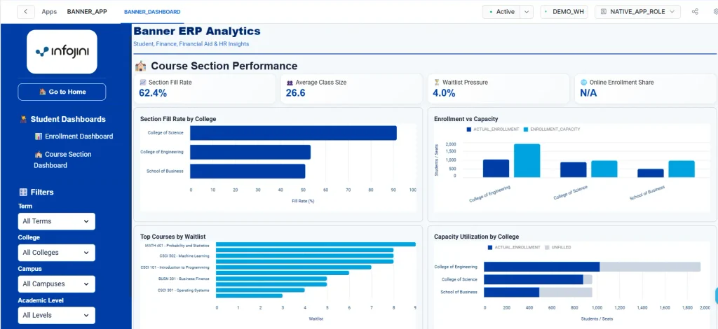
At the top of the dashboard, users can review key performance indicators such as Section Fill Rate, Average Class Size, Waitlist Pressure, and Online Enrollment Share. These metrics provide a quick summary of how effectively course sections are being utilized and whether student demand is aligned with available instructional capacity. Online Enrollment Share is reserved for a future release and currently displays N/A.
The dashboard includes visualizations such as Section Fill Rate by College, Enrollment vs Capacity, Top Courses by Waitlist, and Capacity Utilization by College. These views allow users to compare utilization across colleges, identify over-filled or under-filled sections, review courses with waitlist activity, and evaluate whether available seats are being used efficiently. A collapsible Course Section Details table lists each section with its instructor, capacity, enrollment, fill rate and waitlist.
The Term, College and Campus filters apply to the Course Section Dashboard. Sections are not tied to a single student level, so the Academic Level filter affects the Enrollment Dashboard only. By applying these filters, users can narrow down the analysis to a specific academic period, organisational unit or campus location, making the dashboard useful for both high-level monitoring and detailed planning discussions.
Finance Module Page
Procurement Dashboard
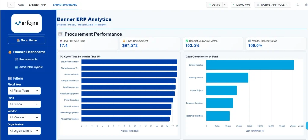
The Finance Module page displays finance-focused dashboards and filters. In the Procurement Performance view, users can review key metrics such as Average PO Cycle Time, Open Commitment, Receipt-to-Invoice Match, and Vendor Concentration. The page also includes visual charts such as PO Cycle Time by Vendor and Open Commitment by Fund.
The left sidebar for the Finance Module includes dashboard navigation for Procurements and Accounts Payable. It also provides filters for Fiscal Year, Fund, Vendor, and Organisation. These filters help procurement and finance users analyze spend, commitments, vendor performance, and payable activity by the relevant financial dimensions.
Accounts Payable Dashboard
The Accounts Payable Dashboard focuses on payables performance, vendor balances, payment timing, and working-capital visibility. It helps finance teams understand how quickly invoices are paid, where open balances are concentrated, and whether payment operations are meeting expected timelines.
At the top of the dashboard, users can review key performance indicators such as Days Payable Outstanding, Discount Capture Rate, Open AP Balance, and On-Time Payment Rate. These metrics provide a quick view of payment efficiency, outstanding liability, discount capture opportunities, and payment compliance.
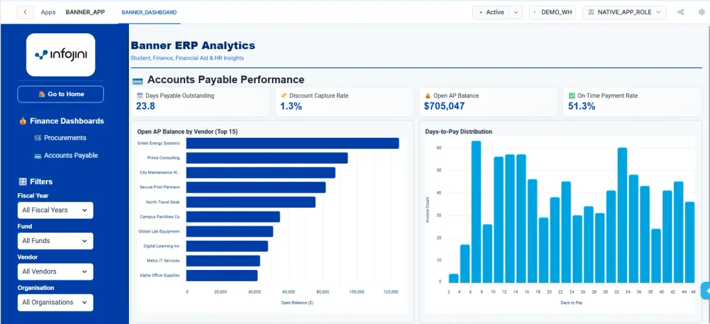
The dashboard includes visualizations such as Open AP Balance by Vendor and Days-to-Pay Distribution. These views help users identify vendors with the highest outstanding balances, understand invoice payment timing patterns, and detect opportunities to improve cash management or accelerate payment processing where needed.
The same Finance Module filters apply to the Accounts Payable Dashboard, including Fiscal Year, Fund, Vendor, and Organisation. By applying these filters, users can narrow the analysis to a specific financial period, funding source, supplier, or organisational unit for more targeted accounts payable review.
Financial Aid Module Page
Financial Aid Overview Dashboard
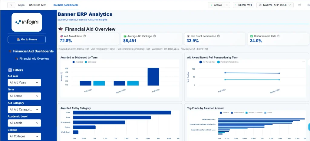
The Financial Aid Module page contains the Financial Aid Overview dashboard. The left sidebar provides filters for Aid Year, Term (limited to the terms of the selected aid year), Aid Category (Grant, Loan, Scholarship, Work-Study, Waiver), Academic Level, and College.
KPIs and Visualizations
At the top of the dashboard, four KPI cards show Aid Award Rate, Average Aid Package, Pell Grant Penetration and Disbursement Rate, followed by a summary line with enrolled student-terms, aid recipients, Pell recipients, total awarded and total disbursed. Hovering over a KPI card shows its formula.
The dashboard includes four visualizations: Awarded vs Disbursed by Term, Aid Award Rate & Pell Penetration by Term, Awarded Aid by Category, and Top Funds by Awarded Amount (coloured by federal, state, institutional or private source). A collapsible Award Status & Fund Details section shows the award status mix (offered, accepted, paid, declined, cancelled) and a fund-by-term detail table.
How Enrollment-Based Rates Work
Measured against enrolled students
Enrollment-based rates use the enrolled population from the Student module (registrations whose status counts toward enrollment) as the denominator, and count students once per term. Terms without registrations show N/A for these rates. The Aid Category filter narrows the aid side only, so choosing Grant answers what share of enrolled students received a grant.
Human Resources Module Page
Shared Filters and KPI Scope
The Human Resources Module page contains five dashboards selected from the sidebar: Workforce, Payroll, Leave & Absence, Benefits, and Position & Vacancy. All five share the same filters: Payroll Year, Pay Period, Organisation, Employee Class (Faculty or Staff), and Employment Type (Full-Time or Part-Time).
Point-in-time vs cumulative KPIs
Each dashboard states its scope under the title. Point-in-time KPIs – headcount, FTE, tenure, average salary, compa-ratio, leave balance, benefits enrollment and vacancy – are shown as of the latest pay period in the selection. Cumulative KPIs – turnover, payroll cost, overtime, leave taken and benefit cost – add up across all selected periods.
Workforce Dashboard
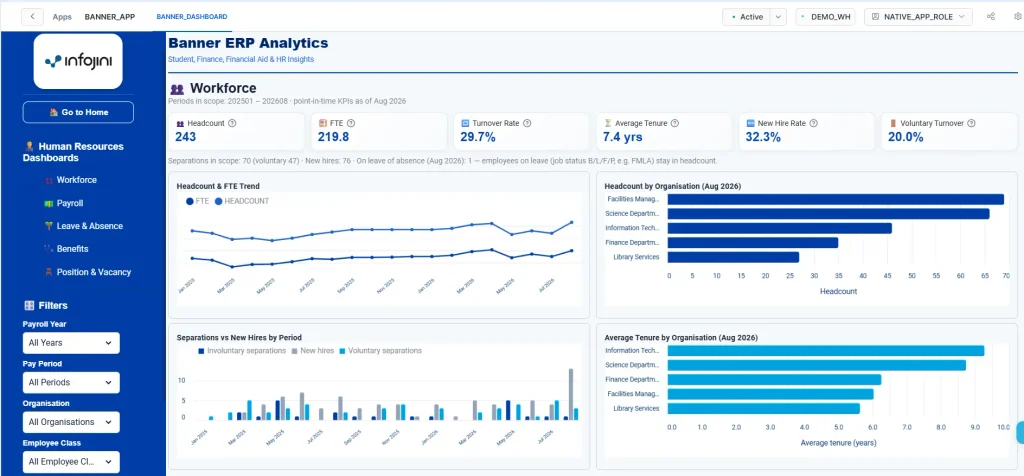
KPI cards show Headcount, FTE, Turnover Rate, Average Tenure, New Hire Rate and Voluntary Turnover, with a summary of separations, new hires and employees currently on a leave of absence (who remain in headcount). Charts show the Headcount & FTE Trend, Headcount by Organisation, Separations vs New Hires by Period, and Average Tenure by Organisation. A details table breaks headcount, FTE, and average salary down by organisation and job category.
Payroll Dashboard
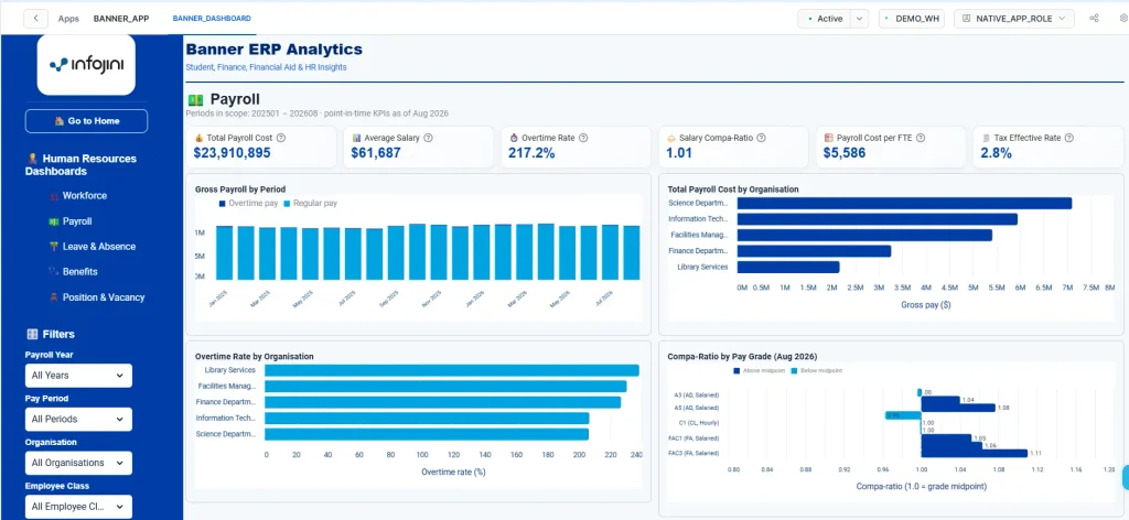
KPI cards show Total Payroll Cost, Average Salary, Overtime Rate, Salary Compa-Ratio, Payroll Cost per FTE and Tax Effective Rate. Charts show Gross Payroll by Period (regular versus overtime pay), Total Payroll Cost by Organisation, Overtime Rate by Organisation, and Compa-Ratio by Pay Grade against the 1.0 midpoint line. A summary table lists gross pay, overtime, paid leave, taxes, employee and employer benefits and net pay by organisation.
Leave & Absence Dashboard
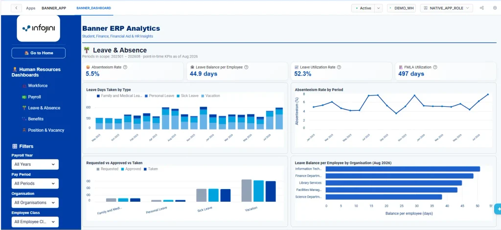
KPI cards show Absenteeism Rate, Leave Balance per Employee, Leave Utilization Rate, and FMLA Utilization. Charts show Leave Days Taken by Type, Absenteeism Rate by Period, Requested vs Approved vs Taken leave by type, and Leave Balance per Employee by Organisation. Vacation, sick, and personal leave come from Banner leave history; FMLA days come from FMLA leave events and their recorded usage.
Benefits Dashboard
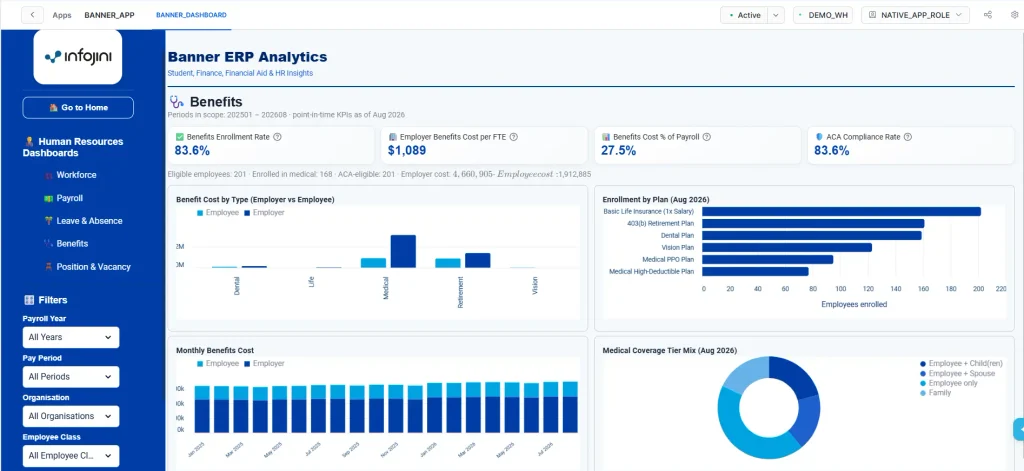
KPI cards show Benefits Enrollment Rate, Employer Benefits Cost per FTE, Benefits Cost as % of Payroll and ACA Compliance Rate, with a summary of eligible, enrolled and ACA-eligible employees, total employer, and employee cost. Charts show Benefit Cost by Type (employer versus employee), Enrollment by Plan, Monthly Benefits Cost, and Medical Coverage Tier Mix.
Position & Vacancy Dashboard
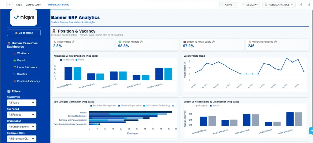
KPI cards show Vacancy Rate, Position Fill Rate, Budget vs Actual Salary, and the number of Authorized Positions. Charts show Authorized vs Filled Positions by organisation, the Vacancy Rate Trend, EEO Category Distribution by organisation, and Budget vs Actual Salary by Organisation. A details table lists vacant positions with title, organisation, pay grade, FTE, budget status, and budgeted salary. Positions that are frozen or never budgeted are not counted as authorized.
Intended Users
| Role | How they use the app |
|---|---|
| Registrars and academic administrators | Monitor enrollment, new student intake, credit hours, and academic demand. |
| Deans and academic planners | Review enrollment distribution, campus-level trends, and course section utilization. |
| Procurement officers | Track purchase order cycle time, open commitments, matching performance, and vendor spend. |
| Controllers and finance leadership | Monitor accounts payable performance, payment timeliness, discounts, and outstanding balances. |
| Financial aid directors and counselors | Review award reach, average packages, Pell penetration, and disbursement progress by aid year and term. |
| HR business partners and workforce planners | Track headcount, FTE, turnover, tenure, and the EEO mix of the workforce. |
| Payroll and benefits administrators | Monitor payroll cost, overtime, taxes, leave usage, benefits enrollment, cost, and ACA compliance. |
| Budget and position control analysts | Follow authorized, filled and vacant positions, and compare incumbent salaries with budget. |
Navigation Summary
Moving Through the App
Users start on the Home page to understand the application purpose and available modules. From the sidebar, they can switch between the Student, Finance, Financial Aid, and Human Resources modules. Within each module, users select a dashboard and apply the available filters to refine the displayed metrics and visualizations; the Go to Home button returns to the Home page at any time.
Filters by Module
| Module | Sidebar filters |
|---|---|
| Student | Term, College, Campus, Academic Level |
| Finance | Fiscal Year, Fund, Vendor, Organization |
| Financial Aid | Aid Year, Term, Aid Category, Academic Level, College |
| Human Resources | Payroll Year, Pay Period, Organization, Employee Class, Employment Type |
Conclusion
Banner ERP Analytics turns Banner operational data into a single, connected analytics experience inside Snowflake. With four modules, ten dashboards, and one shared data model. Registrars, finance teams, financial aid offices, and HR can work from the same governed numbers, move between modules without switching tools, and keep every query close to the data it describes.